diana lam
Perceptions of Urban Perception - Perceived vs. Actual Safety in NYC Neighborhoods
Looking for the interactive neighborhood exploration tool? You can access it at this link.
If I gave you the choice between the two images below, which would you pick as the safer looking image?
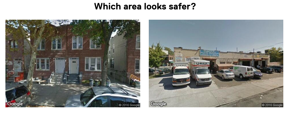
Most people, including myself, would choose the image on the left. However, the image on the left is actually an image of a street in one of New York City’s most dangerous neighborhoods, East New York, which has a crime rate of over three times the citywide median (about 30 crimes per 1,000 residents & workers in 2014, compared to the median of 9 crimes). The image on the right is from Borough Park, one of the city’s safest neighborhoods (about 2 crimes per 1,000 residents & workers in 2014).
The difference between our perception of the urban landscape and the actual experience if neighborhoods is a divide that’s prevalent in cities across the world. Sociologists and urbanists have studied this extensively, with the most prominent theory being that of broken windows–the idea that signs of disorder in urban environments, such as graffiti or littering, lead to more severe crimes and other negative impacts in neighborhoods.
As an architect and urban planner (who actually wanted to be a sociologist early on!), I wanted to try and bridge this gap between perception and reality for my final project at Metis. I sought to answer the question of: What are the differences between perceived and actual safety in NYC neighborhoods? And how can we use this information to improve the way we explore cities?
Data and approach
I had three primary questions/goals I wanted to answer/achieve in for this project:
ONE: Identify the neighborhoods that are perceived as more or less dangerous than reality;
TWO: Understand the characteristics of the neighborhoods where there is a strong disparity between perception and reality by identifying the socioeconomic, demographic, and physical characteristics that describe these neighborhoods; and
THREE: Create a tool that allows residents, visitors, and policymakers to explore neighborhoods, their urban streetscape, how their safety perception differs from reality, and the associated features that describe them.
For the first task, I utilized perception data from Streetscore, a project by researchers at MIT Media Lab where they assigned perceived safety scores to about 300,000 geolocated images (longitude, latitude points) across NYC. Scores were developed through an online study where they presented participants with two images and asked them to choose the image that looked “safer” (similar to the question I posed at the beginning of this post).
Actual crime data came from the NYPD’s 2014 records for the seven major felony incidents (assault, grand larceny, burglary, rape, murder, robbery, and grand larceny of motor vehicles)–about 105,000 geolocated incidents for that year.
For the second task, I gathered a little over 20 socioeconomic, demographic, and physical features from the U.S. Census/American Community Survey, 311, NYC Open Data, U.S. Department of Housing and Urban Development and NYC Department of City Planning. Features included age, income, race, educational attainment, land use, building heights, and housing affordability, among others.
Note that for the purposes of this project, I defined each neighborhood as a census tract, since census tracts are drawn with the intention of achieving a homogeneous sample of economic and demographic characteristics per tract. To compare tracts, I reverse-geolocated the coordinate data into census tracts using r-trees (more on that in a separate post!)
What neighborhoods are perceived as more or less dangerous than reality?
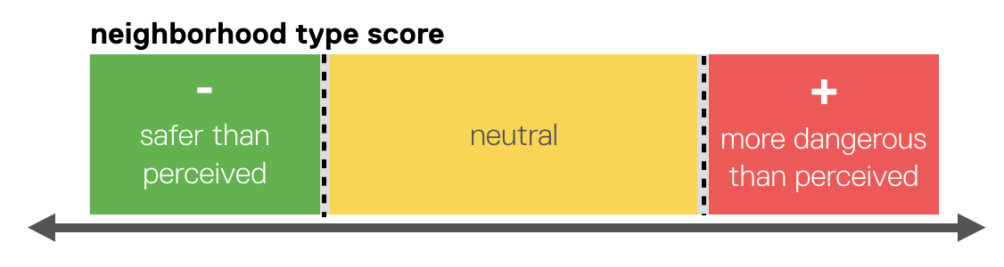
To determine the degree of difference between perceived danger and actual crime in each neighborhood, I developed a custom score for each tract that described its perceived danger score and crime rate in relation to the median score/rate within the sample. This is similar to a z-score, except I used the median instead of the mean to make the mechanism more robust to outliers in the data. Using these scores, I computed a “difference score” for each neighborhood, which described if the area was safer than perceived (a negative score), neutral, or more dangerous than perceived (positive). To make this score more interpretable, I assigned one of the three labels to each neighborhood based on the score’s deviation from the median difference score.
In the map below, red represents neighborhoods that are more dangerous than perceived, green represents neighborhoods that are safer than perceived, and yellow represents neighborhoods that are somewhat neutral.
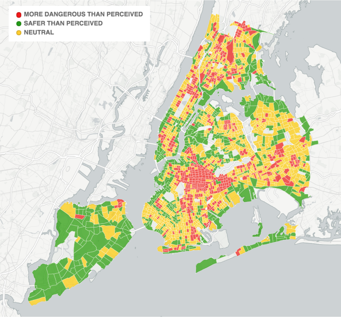
A few patterns start to emerge here:
- We can see that neighborhoods that are safer than perceived ring around the edges of the city, in areas that are likely more industrial and less populated (with the exception of Staten Island, but hey, it’s Staten Island!).
- We can see that neighborhoods that are more dangerous than perceived are located in the interior of the city, with a large concentration in Brooklyn.
What characterizes each neighborhood type?
So can we confirm our hunch about industrial neighborhoods? What can we learn about neighborhoods that are more dangerous than perceived beyond just their locations on a map?
Once I had a neighborhood type label for each tract, I built a multinomial logistic regression model to predict the class of each neighborhood using about 20 different socioeconomic, demographic, and physical features. The purpose of the model was to assess the importance of each feature in determining whether a neighborhood was safer than perceived, neutral, or more dangerous than perceived, with the ultimate goal of identifying the top features that characterized each neighborhood type.
It should be noted that the purpose of this was not to establish a causal relationship between these features and neighborhood type–i.e. to say that a neighborhood with an older population causes a neighborhood to be perceived a certain way–but instead, the goal was to try and answer the questions of “Who lives here?” and “What does the physical landscape look like?” for each neighborhood type.
So what did we find? The charts below show the top five most important features for neighborhoods that are perceived differently than reality. One of my favorite things about logistic regression models–and the reason why I chose to use one here–is the interpretability. Each bar in the chart below illustrates the percentage increase or decrease in the odds of a neighborhood being safer/more dangerous than perceived as a result of a one unit increase in that feature. For example, a one percentage increase in the industrial square footage as a total of all built area in a neighborhood leads to a 58% increase in the odds of that neighborhood being safer than perceived. For a refresher on what “odds” means, click here.
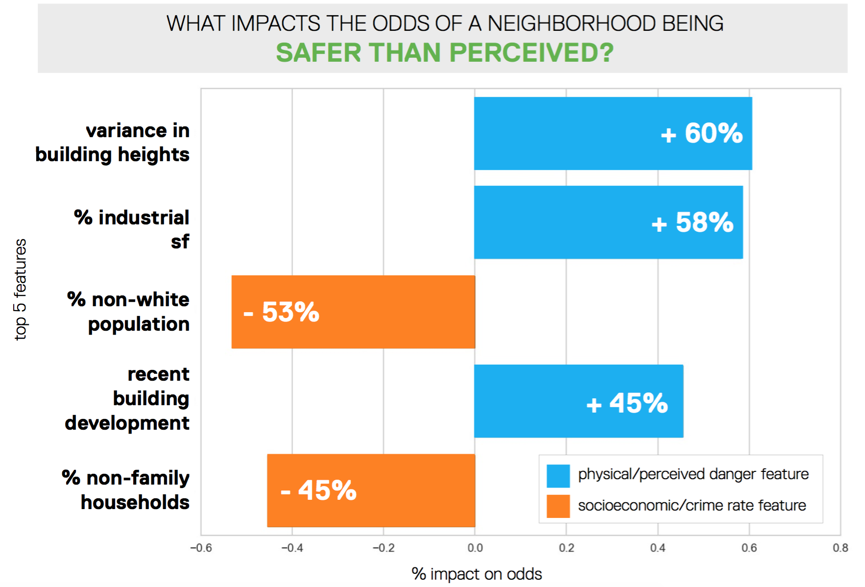
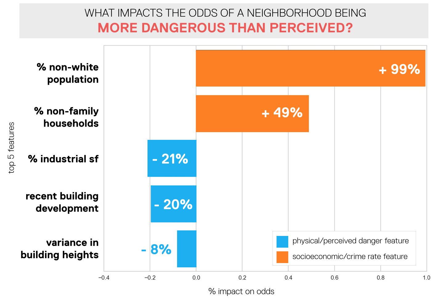
To summarize, a neighborhood that is safer than perceived is likely to be a newer neighborhood (i.e. more recently built buildings) with more industrial square footage, varying building heights, a smaller non-white population, and more family households.
A neighborhood that is more dangerous than perceived is likely to be an older, non-industrial neighborhood with homogeneous building heights, a larger non-white population, and more non-family households.
A better neighborhood exploration tool
Given the initial goal of my project to improve neighborhood exploration, I built an interactive tool that allows a user to visualize the difference between perception and actual crime; key socioeconomic, demographic, and physical characteristics; and the streetscape for any given neighborhood. My vision for this tool is that it be used by not only residents and visitors, but also policymakers to gain a better understanding of how streetscapes, perception, crime, and socioeconomic/demographic characteristics are related. Particularly in New York City, where zoning and land usage is changing so rapidly, whether organically or through City action, this tool can provide a new perspective that may guide urban and capital planning initiatives.
See below for a snapshot of the tool; it will behave a little funkily in the iframe – please access the full app through this link. Enter an address or click a neighborhood to get started.
Next steps
I loved working on this project because it allowed me to marry my interests in data science/machine learning, urban planning, and visualization. As an urbanist, I see this tool as the first step in a larger dialogue about the way cities are changing, the built environment, and the impacts on livability that it has.
What I’d really love to do next with this project is track changes over time in perception, actual crime, and the associated socioeconomic/demographic characteristics. With there being so much discussion in the city about gentrification and the way neighborhoods are changing, this would be a fascinating long-term project that could ultimately tell a story of New York City’s evolution that is difficult to capture with simple statistics alone.
Another angle I’d love to explore is the middle ground between sheer perception of a streetscape and actual crime data, i.e. residents’ perceptions of safety in a given neighborhood. If you gave New York City residents the choice between two images, but identified which neighborhood each image was from, would it change their responses? How do anecdotal experiences of neighborhoods impact the difference between perception and reality and how is this different based on residents’ ages and the length of time they’ve lived in the city?
Thanks for reading. If you have any questions/reactions/ideas, I’d love to hear from you! You can reach me at lam.diana.hc@gmail.com.