diana lam
Munging the MTA - Optimizing a Non-Profit's Street Team Placements
As a lifelong New Yorker, I’ve come to find street team canvassers to be a common occurence during my daily commutes. I’ve always wondered how effective these teams are and how they decide to place themselves–anyone who has observed the interaction of strangers in New York City before will tell you that canvassers are not typically met with enthusiasm. Rather, people tend to go out of their way to avoid interaction. For my first project at my data science fellowship at Metis, I was asked to dive into exactly this question–outside what subway stations should a women’s tech non-profit deploy their street team members in order to drive attendance to their annual gala and spread awareness for their cause?
The goal
Having worked at a non-profit in the past, I know how critical it is that any activity that the organization expends resources on do double duty. At the heart of the question is the primary need to fill attendance at the gala; at the same time, attendees that have an interest in the organization are more valuable than someone who is not. Given this knowledge, the goal becomes clear–provide recommendations on deployment locations that would attract the highest number of gala attendees with greatest potential for future involvement in the organization.
The approach and data
The analysis followed a three-step approach:
-
Maximize attendance by acquiring the greatest number of signups. To isolate the top subway stations by sheer number of users, we’ll take a look at MTA turnstile data for April to May 2015 in order to provide the most relevant trends for an early summer event.
-
Once we’ve isolated stations by traffic, we’ll maximize quality of attendees by targeting areas where people are most likely to be philanthropically involved. So what types of people are most likely to be philanthropic? We looked at philanthropic contributions by zip code data compiled by The Chronicle of Philanthropy to determine areas with the highest median contribution per person as well as gender by zip code data provided by the NYC Department of Youth & Community Development to find areas with more women (since it is after all, a women’s organization).
-
Once we identify the top stations by traffic and philanthropic quality, we’ll optimize recommendations for street team deployment by identifying best days of the week and times of day to deploy.
The analysis
Maximize attendance
The MTA turnstile data we used is notoriously difficult to parse. The data is presented in the form of cumulative counts for entries and exits by turnstile by 4-hour period. Here’s a sample entry from the data file:
R143,R032,02-00-00,TIMES SQ-42 ST,1237ACENQRS,IRT,01/02/2016,03:00:00,REGULAR,0000754332,0001334774
What we’re really interested in here is the station name (TIMES SQ-42 ST), date (01/02/2016), entries (the second to last number, 0000754332 here), and the exits (last number or 0001334774). To find the stations with the most traffic, we calculated the total entries/exits per turnstile per day from the cumulative values and then aggregated these numbers to arrive at total entries/exits per station for the full period.
And the top stations are…
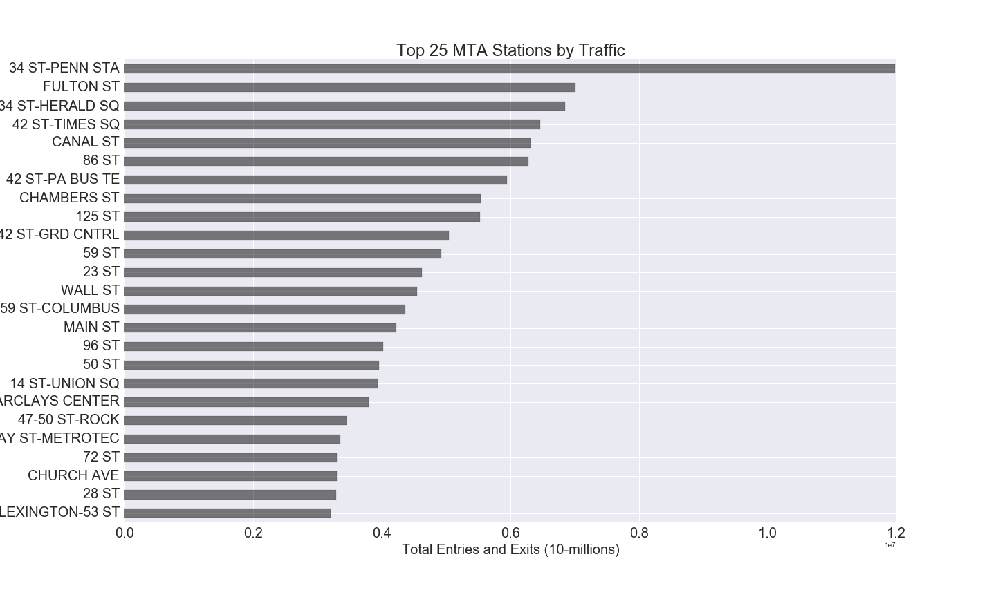
The top four stations here made sense–they’re all big transfer hubs. But we noticed a few odd top runners such as 86th St and 125th St, which are all more residential areas. Turns out there are a handful of MTA stations that share the same name, but are in totally different areas! We wound up dropping these values, since they were unlikely to be top runners on their own. There are also some stations sharing the same name that are technically separate (such as the Chambers St - 2/3 and Chambers St - A/C) but very close in geography–we decided to keep these values and consider them as one station.
Maximize quality
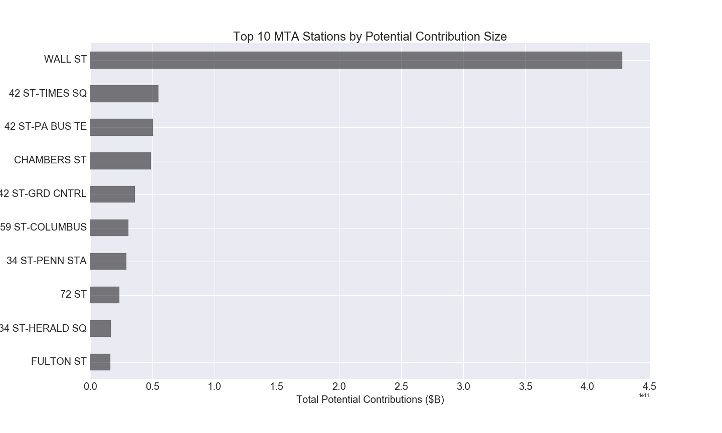
To determine the likelihood of philanthropic contributions by area, we cross-walked data on median charitable contributions per person to station traffic, using zip code as the common factor, and sized the total potential contribution to compare stations.
As you can see below, Wall St comes out as a clear front runner with nearly $500 billion in total potential contributions (the median per person contribution to charity in 2012 was almost $95,000!), followed, by Grand Central, Port Authority, Times Square, Chambers St, and Columbus Circle.
We also took a look at some gender ratio by zip code data, but it wasn’t very robust or well-documented (a common problem with NYC Open Data…). As a high-level consideration, gender is interesting since the organization is women-focused, but likely has less practical impact when you’re on the ground (i.e. if traffic is high enough, the street team could just choose to target women and the actual pre-existing women/men ratio would not matter).
Optimize recommendations
Once we had our top six stations, we dug into day by day and time of day traffic patterns to determine the optimal times to deploy street teams. All of our stations had a consistent pattern, so let’s look at our front runner, Wall St, as an example.
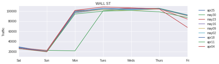
Not surprisingly, weekdays, specifically Monday through Thursday, have the greatest traffic (all of that summer Friday travel!). The Monday dip you see in the week ending May 30 (green line) is Memorial Day.
Next, we looked at traffic by time of day in four hour blocks.
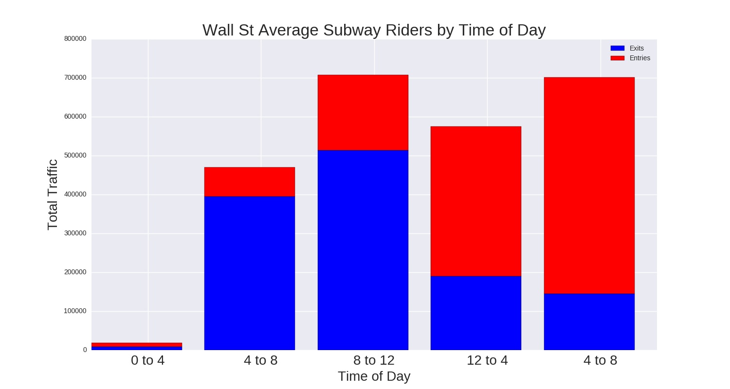
As expected, the times of day with the highest traffic are the 8AM - 12PM and 4PM - 8PM windows, both of which capture rush hour.
Recommendations and next steps
Based on the data considered and analysis so far, we’d recommend deploying street teams between Monday and Thursday (except Memorial Day!) between 8AM - 12PM and 4PM - 8PM to obtain the greatest number of event signups with the highest potential for quality attendees.
Of course, these recommendations should be taken with a grain of salt–given the iterative process of data science and the short time frame (one week!) for this exercise, the analysis and findings are definitely the first iteration of findings. With more time, there are a number of additional points I’d love to dig my teeth into:
Optimizing station selection
-
Residence vs. station usage: The philanthropic contribution data we used was based on tax returns, so zip codes are indexed to where people live, not necessarily where they work. Given that our top stations are primarily in office hubs and also that our time of day recommendations are during rush hour, we’re likely to capture workers in the area (for whom we cannot estimate philanthropic inclinations). To refine our model, I’d love to find some additional data that describes the relationship between where people live and their commuting patterns (perhaps Journey to Work data from the Census?).
-
Other demographic/sectoral data: The particular focus of a non-profit organization will likely define its supporters. Given that our non-profit was a tech organization, I would have loved to have considered areas with high concentrations of tech companies and affilitated orgs. The easiest way to do this would probably be to use NAICS codes and Bureau of Labor Statistics data, but finding the right level and type of classification for tech companies is difficult, since codes are based on industry (i.e. the type of product) as opposed to the type of company.
For example, Uber would probably be classified under code
48-49 - Transit and Ground Passenger Transporationinstead of what most of us would assume tech comapnies are under, either51 - Informationor54 - Professional, Scientific, and Technical Services. There are ways to dig in deeper down to the six-digit code level, but these problems continue to persist. This is actually an issue that my old firm, HR&A Advisors, tackled in our study of the NYC tech ecosystem–we hand-picked a set of NAICS codes to try and capture the tech industry. The best strategy here might just to be to pull the old domain knowledge card–Flatiron, the Meatpacking District, DUMBO, and Long Island City are probably good bets for tech.There are also many other factors I’d like to consider outside of industry: what about race and age? What about general foot traffic (e.g. areas with a lot of pedestrian activity, such as Broadway in SoHo)?
User interface
One of the reasons I decided to leave economic development/policy consulting and transition into tech was the desire to do something more with data than just produce charts and powerpoints. I’d love to build a tool here that empowers the client to use the data for their needs in the future, since the availability of their street team resources will likely fluctate. Perhaps a dashboard where the input would be street team capacity and the time/day availability, and the output would be a recommendation of the top three areas to deploy and/or a route for the time frame?
Code and presentation
The top stations analysis scripts are available at my GitHub repo and our findings presentation can be viewed here.